Build Your Own Pinterest Analytics Dashboard (Pull the Numbers That Matter via API)
Pinterest’s built-in analytics are fine — until you want your numbers in your own dashboard, next to everything else. Here’s how to pull the metrics that matter via API and build a report that updates itself.

I have a slightly nerdy confession: I love a good dashboard. There’s something deeply satisfying about opening one page and seeing exactly how things are going, no digging required. And for Pinterest, the difference between people who improve and people who plateau usually comes down to whether they actually look at their numbers — and whether those numbers live somewhere they’ll actually see them. That’s the whole case for building your own dashboard: not fancier charts, just your Pinterest data sitting where you already look every day.
Pinterest’s built-in analytics are perfectly fine for a quick check. But they live in a separate place you have to remember to visit, they don’t sit next to your other business numbers, and they don’t easily let you build custom views. The moment you want your Pinterest metrics in a Google Sheet next to your sales, or in a Notion page next to your content calendar, you need to pull the data out. And pulling data out is exactly what an API is for.
This post pairs with two others: the metrics that actually matter (so you know what to track) and the Burnpedia API guide (so you know how to pull it). Here I’m connecting the two into a practical “build your own dashboard” plan.
First, decide what’s worth putting on the dashboard
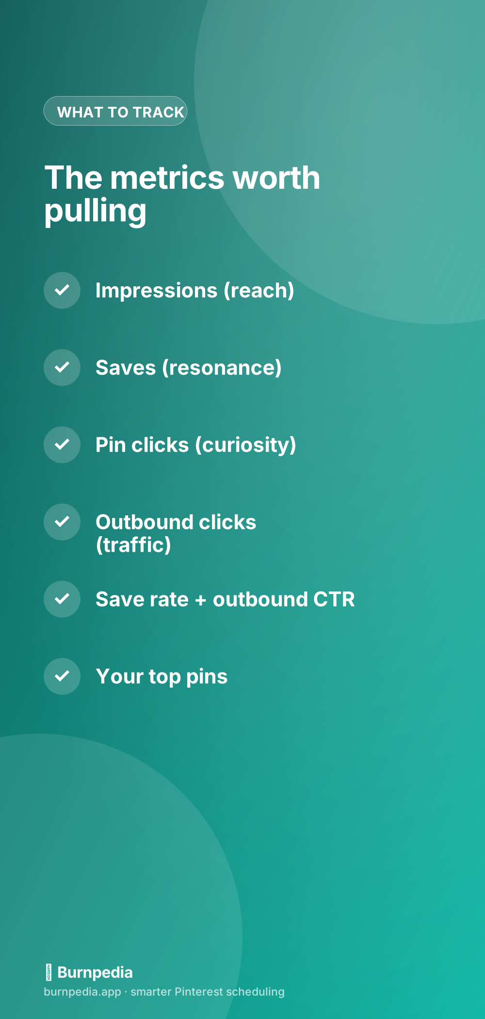
The biggest mistake people make with analytics is tracking everything, which means tracking nothing — a wall of numbers you never act on. A good dashboard is ruthless. It shows the handful of metrics that actually change your decisions and hides the rest. For Pinterest, that short list is impressions, saves, pin clicks, outbound clicks, and two or three derived rates.
- Impressions — how many times your Pins were seen. This is your reach, the top of the funnel.
- Saves — how many people bookmarked a Pin for later. This is resonance: proof your content is worth keeping.
- Pin clicks — clicks to see the Pin bigger. A signal of curiosity.
- Outbound clicks — clicks that actually left Pinterest and went to your site. This is the money metric for most of us.
- Save rate & outbound CTR — saves and outbound clicks as a percentage of impressions. These normalize for reach, so a small Pin with a great rate isn’t hidden behind a big Pin with a mediocre one.
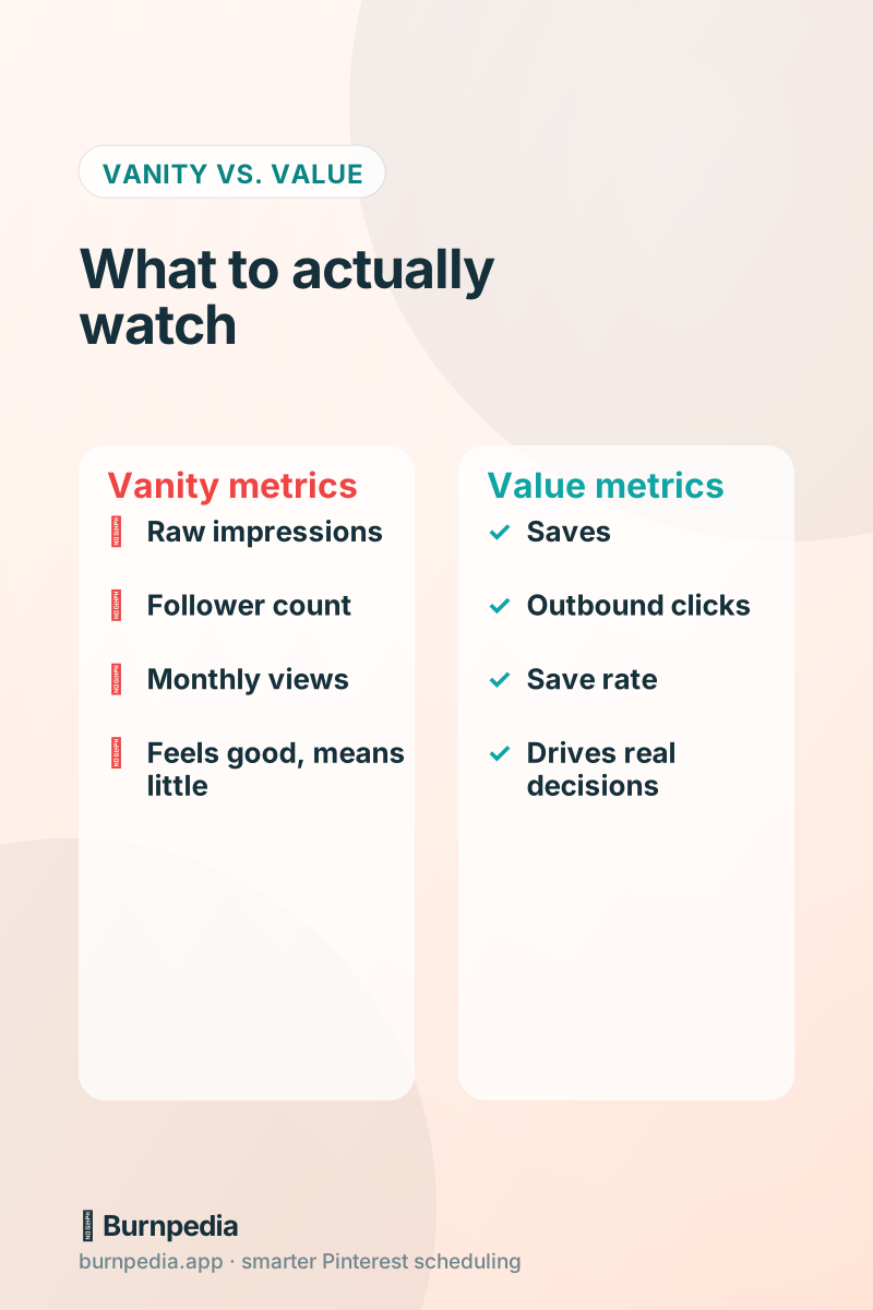
Notice what’s not on that list: follower count and “monthly views.” They feel important and they make lovely screenshots, but they rarely change a single decision. A dashboard full of vanity metrics is just a mood ring. Keep it honest.
How the data gets from Pinterest to your dashboard
Conceptually, it’s three steps. One: a scheduled job (daily or weekly) calls the analytics endpoint and asks for your numbers over a date range. Two: it also grabs your top-performing Pins. Three: it writes all of that into wherever your dashboard lives — a Google Sheet, a database, a Notion table. Because it’s on a schedule, the dashboard refreshes itself. You build it once; it updates forever.
The nice thing about pulling analytics through the Burnpedia API specifically is that it already returns the derived rates — save rate, outbound CTR, average daily impressions — pre-calculated. So you’re not doing math in your spreadsheet; you’re just displaying numbers that are already the right ones. Less fiddling, fewer formula bugs, more looking at the actual insight.
const res = await fetch("https://burnpedia.app/api/v1/analytics", {
  headers: { Authorization: "Bearer bp_live_YOUR_API_KEY" },
});
const { totals, daily } = await res.json();
// totals.save, totals.outboundClick, totals.saveRate, totals.ctr, ...
console.log(totals.saveRate, totals.ctr);
That’s genuinely most of the work. Point that at a Google Sheet with a scheduled script (Google Apps Script is perfect for this), and you’ve got a self-updating Pinterest report. No screenshots, no manual entry, no “ugh, it’s reporting day.”
A dashboard layout that actually gets used
Here’s a layout I like. At the very top, a single row of big numbers: this week’s outbound clicks, saves, and impressions, each with a little arrow showing up or down versus last week. That’s the “how are we doing?” glance — the thing you read in three seconds. Below that, a simple line chart of outbound clicks over time, because trend beats snapshot. And at the bottom, a gallery of your top five Pins this month, so you can see what’s working with your own eyes.
That’s it. Resist the urge to add twelve more charts. A dashboard you actually read once a week beats a beautiful one you open once and never again. The whole point is to make good decisions easy, and easy means simple.
Turning the numbers into decisions
A dashboard is only useful if it changes what you do. So build in the questions. When outbound clicks dip, ask: did I slow down posting, or did my Pin quality drop? When a Pin has a high save rate but low outbound clicks, ask: is my Pin great but my landing page weak? When one board consistently outperforms, ask: should I make more content in that theme? The metrics are just prompts; the growth comes from acting on the prompts.
This is where owning your data pays off. Because the numbers live where you already work, you notice these patterns naturally instead of only on the rare occasion you remember to check Pinterest’s app. And once you’ve spotted what works, you can lean into it — even automating more of what performs so your best themes get more airtime.
Compare periods, not just points in time
A single number is almost meaningless on its own. “400 outbound clicks this week” — is that good? You have no idea until you compare it to something. So the most valuable thing a dashboard does is put numbers next to their past selves: this week versus last week, this month versus last month, this year versus last. Comparison is where insight lives. A metric that’s flat tells one story; the same metric doubling tells a completely different one.
Pulling data via the API makes period comparison easy because you control the date ranges. Grab this month, grab last month, put them side by side, and let the trend do the talking. I’d rather see one honest week-over-week arrow than a screen full of impressive-looking totals with no context. Build your dashboard around change over time, and you’ll spot both problems and opportunities weeks earlier than you otherwise would.
One caution worth knowing: Pinterest’s analytics only reach back about 90 days for account metrics. So if you want a longer history — year-over-year comparisons, seasonal patterns — you need to pull the data regularly and store it yourself. That’s actually another quiet win of the API-dashboard approach: because you’re saving snapshots over time, you build a historical record Pinterest itself won’t hand you. Future-you, trying to remember what last Christmas looked like, will be grateful.
If you don’t want to build anything
Full honesty, because I always give it: you might not need to build a custom dashboard at all. A good scheduler already shows you these metrics — the rates, the winning-Pins gallery, the trends — in a clean interface, no code required. The custom-dashboard route is for people who specifically want their Pinterest numbers living alongside other data, or who love tinkering. If that’s not you, use the built-in analytics and spend your saved time making Pins.
But if you are the kind of person who wants one page that shows your whole business at a glance — sales, traffic, Pinterest, all together — then pulling your Pinterest data via API is the missing piece, and it’s genuinely satisfying to set up.
The bottom line
Analytics don’t grow your account. Acting on analytics grows your account. And you’re far more likely to act when the right numbers — saves, outbound clicks, save rate, top Pins — live somewhere you already look. Whether that’s a built-in dashboard or a custom one you pull together with the API, the win is the same: measure the things that matter, glance once a week, and steer.
Build the dashboard, keep it simple, and let it quietly tell you the truth about what’s working. That feedback loop — measure, learn, adjust — is the entire engine of growth on Pinterest. Everything else is just making Pins and paying attention. — Sadie
Written by Sadie Brooks
Hey — I’m Sadie. I grew up in a small town outside Columbus, Ohio, moved to Austin for a job I quit within a year, and somewhere in between I started a scrappy little food blog to keep myself sane.
These days I help creators, bloggers, and small U.S. business owners grow on Pinterest without turning it into a second full-time job. I write the Burnpedia blog because I genuinely love this stuff, and because I wish someone had explained it to me in plain English years ago. Pour a coffee, pull up a chair.
Try Burnpedia freeWant Pinterest to run itself?
Every tip on this blog gets easier when your Pins publish on schedule. Burnpedia batches, times, and posts them for you — start free, no credit card.
Try Burnpedia free